Brand identity for Alexandra Bylund
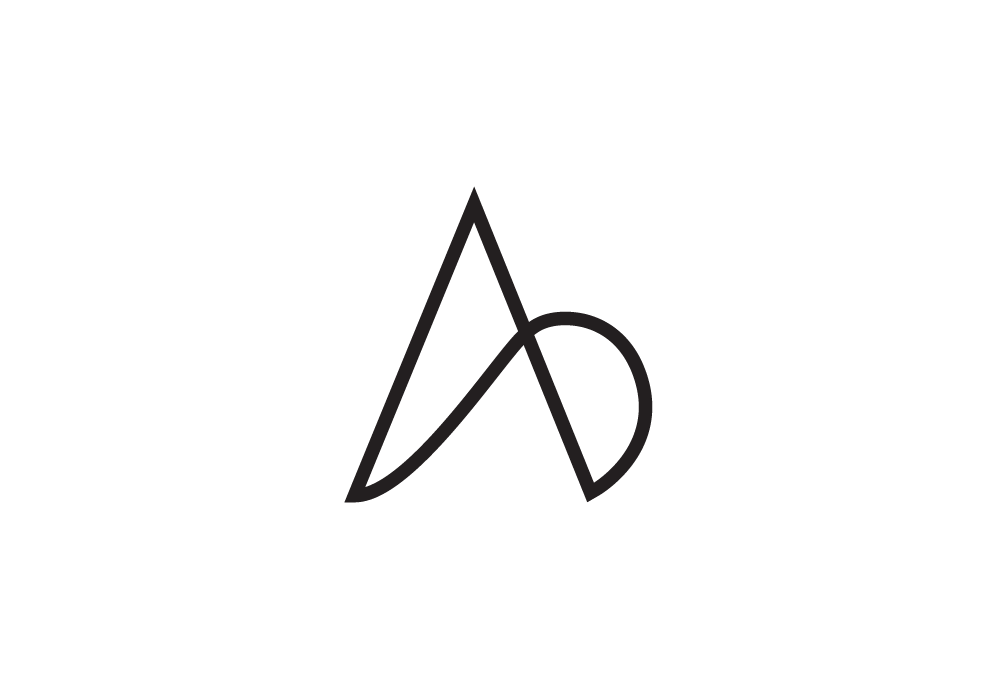
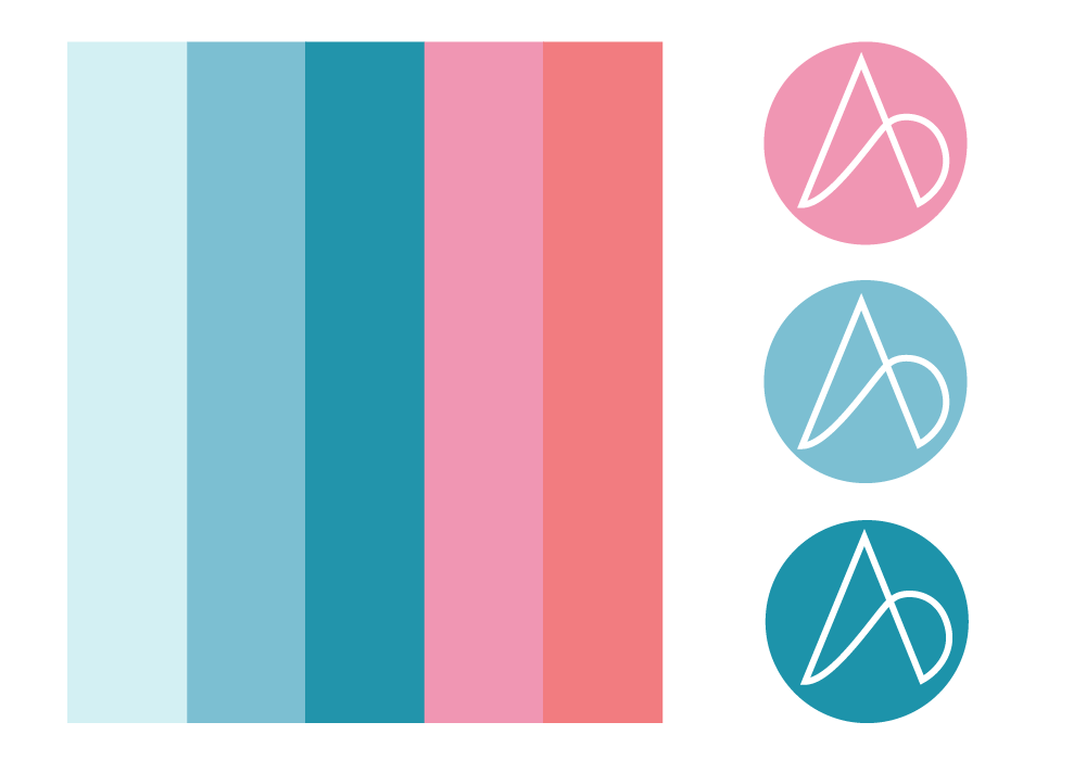
The logo for Alexandra Bylund intertwines the letters "A" and "B", creating a distinct and memorable shape. This sophisticated design represents the integration of her diverse activities gathered under one roof.
The intertwined letters symbolize the seamless fusion of her various areas of operation, presenting a cohesive visual identity that reflects the multifaceted nature of her business.


