Brand Identity - Garden Center
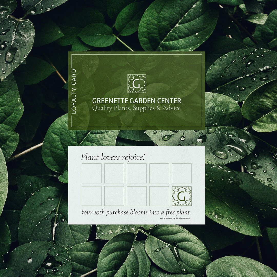
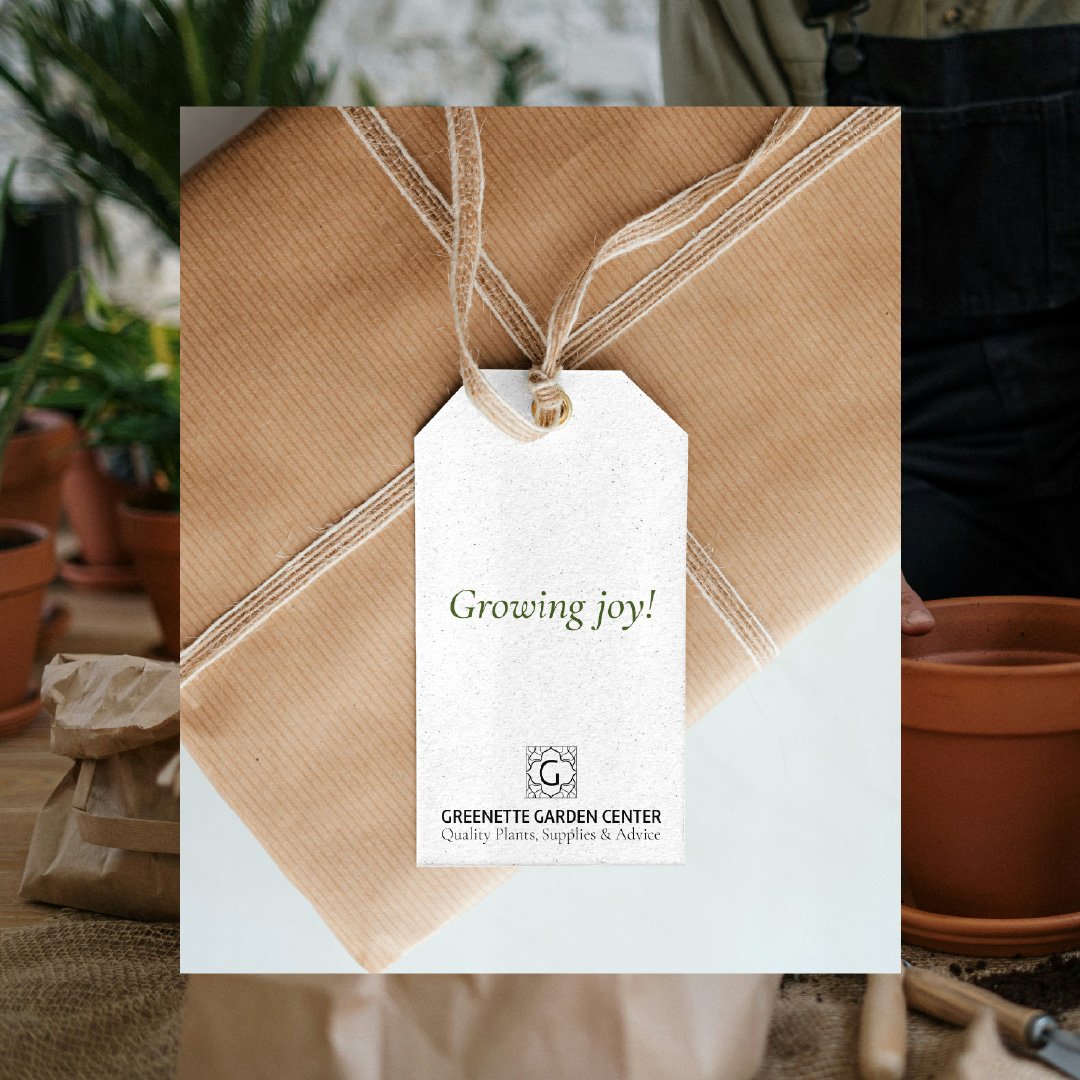
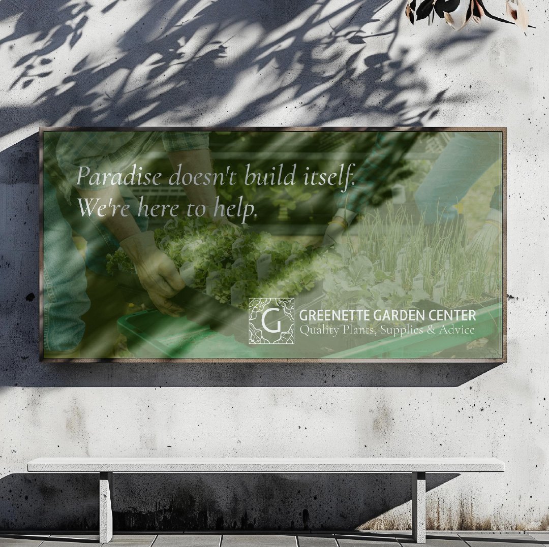
Loved doing this brand identity for Greenette. Let me explain how I brought this garden center to visual life.
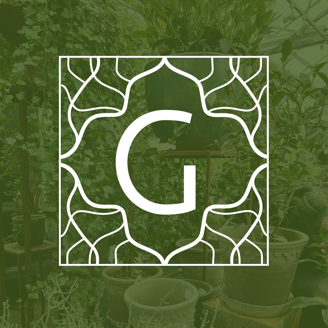
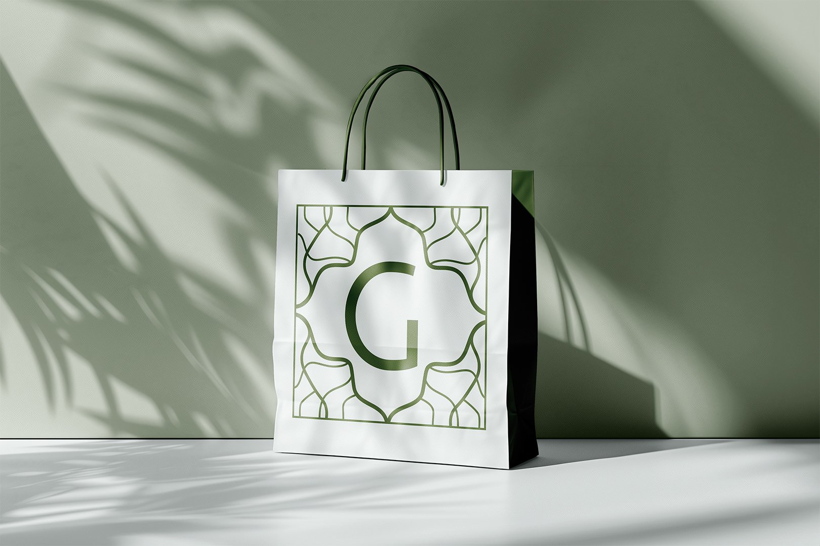
The logo for Greenette was designed with purpose: elegant, organic patterns represent growing branches and the natural flow of a garden, while creating a frame that feels both structured and free-flowing. The 'G' monogram sits at the center, bold yet refined, suggesting both expertise and approachability.
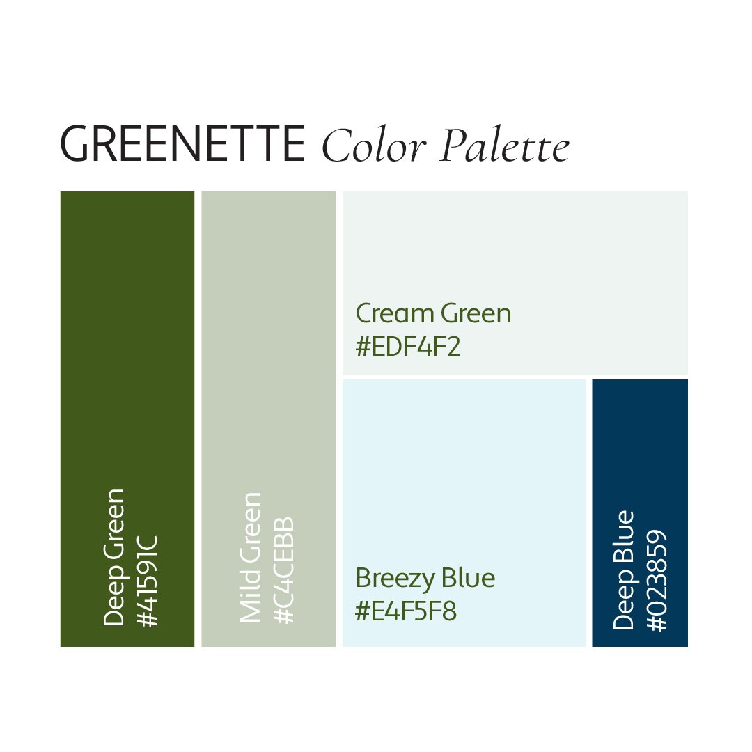
The color palette draws inspiration from a perfect garden day - from deep, rich greens of mature plants to soft sage tones of new growth. To create a feeling of space and light, I incorporated creamy and breezy blue tones that remind us of clear skies and fresh air - elements essential to any thriving garden. A deeper blue accent adds sophistication like shadows in a well-designed garden, creating an atmosphere that's both grounding and uplifting.
