Journey of Emotion
Loved creating this brand identity for Journey of Emotion. Let me share how I brought this emotional wellness concept to life visually.
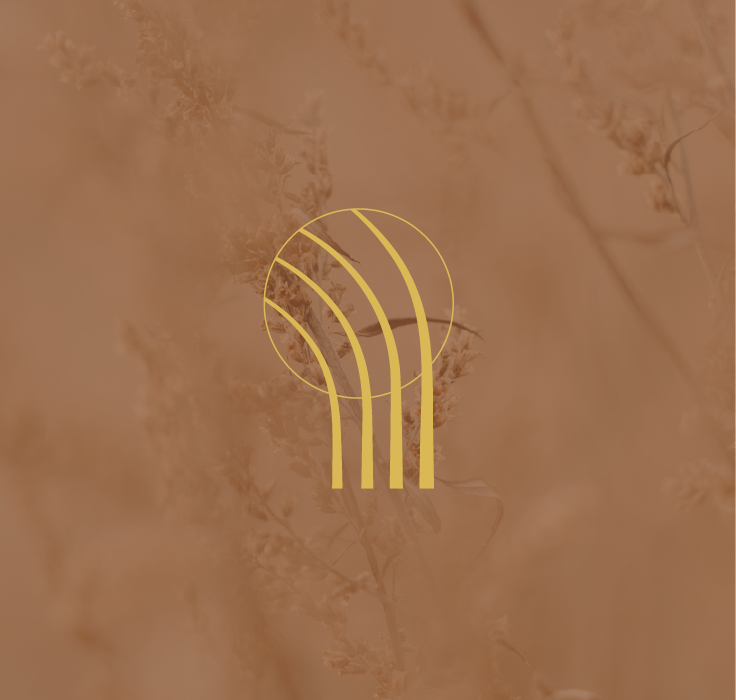
The logo was designed to capture the essence of our emotional journey: organic, ascending lines that curve into a circle, symbolizing both movement and stillness in our emotional experience. Like grass bending in the wind while remaining grounded, this dual representation creates a perfect metaphor for emotional resilience. Each line flows with its own unique path, just as our emotions flow through us naturally and uniquely.
The color palette draws deeply from nature's wisdom, anchored by warm, luminous gold that represents inner wisdom and emotional insight. The earthy, grounding tones create a sense of safety and stability - essential elements for emotional exploration and growth. These colors work together to evoke both professionalism and warmth, making emotional wellness feel accessible and natural.


